The Role of Color Theory in Fashion Visual Merchandising
Understanding the Basics of Color Theory in Fashion
Color theory is a fundamental concept in fashion that explores how colors interact and influence emotions. It consists of the color wheel, which includes primary, secondary, and tertiary colors, forming the basis for creating appealing color combinations. By understanding these relationships, fashion retailers can design displays that attract customers and enhance their shopping experience.
Color is the keyboard, the eyes are the harmonies, the soul is the piano with many strings.
For instance, warm colors like reds and yellows can evoke feelings of excitement and energy, while cool colors such as blues and greens are often associated with calmness and serenity. This emotional connection can significantly influence a shopper's behavior. By leveraging these color associations, brands can curate an environment that encourages customers to engage with their products.
Additionally, color theory isn't just about aesthetics; it also plays a vital role in branding. Consistent use of specific colors can help reinforce a brand's identity and values, making it instantly recognizable. Thus, understanding color theory is essential for fashion retailers looking to create a cohesive and appealing visual merchandising strategy.
The Psychological Effects of Color on Consumer Behavior
Colors have a profound psychological impact on consumers, often influencing their purchasing decisions without them even realizing it. For instance, studies have shown that red can create urgency, prompting quick buying decisions, while blue tends to promote trust and dependability. By understanding these effects, fashion retailers can tailor their visual merchandising strategies accordingly.
Imagine walking into a store with vibrant orange displays; it might make you feel excited and energized, perhaps leading you to grab that trendy outfit. Conversely, a store filled with soft pastels may evoke a sense of calm, making shoppers take their time and browse leisurely. Such strategic use of color can significantly enhance the overall shopping experience.
Color Influences Shopper Emotions
Understanding color theory helps retailers design displays that evoke specific emotions, enhancing customer engagement.
Moreover, retailers can adapt their color choices based on seasonal trends or specific promotions. For example, using rich, warm colors during the fall season can create an inviting atmosphere that aligns with seasonal themes. This adaptability allows brands to stay relevant and connect with their target audience effectively.
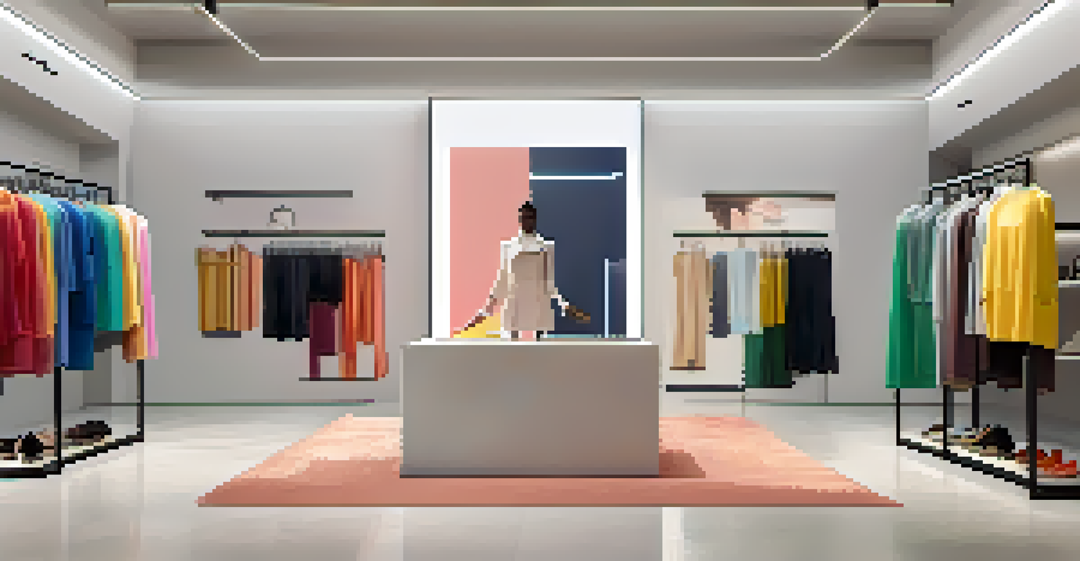
Creating Cohesive Color Palettes for Fashion Displays
A cohesive color palette is essential for effective visual merchandising in fashion. It helps create a harmonious look that draws customers in and keeps them engaged. When choosing colors, retailers should consider complementary colors that enhance one another, creating visual interest without overwhelming the viewer.
Colors are the smiles of nature.
For example, pairing a bold red dress with neutral accessories can help the outfit stand out while still maintaining an elegant balance. This technique not only highlights key pieces but also encourages customers to envision how they can mix and match items in their own wardrobes. A well-planned palette can guide shoppers through the store, leading them to various displays.
Furthermore, seasonal color trends can also play a significant role in palette selection. By incorporating trending colors into their displays, retailers can remain current and relevant, enticing customers to explore new styles. This strategic approach to color can significantly enhance the overall shopping experience and boost sales.
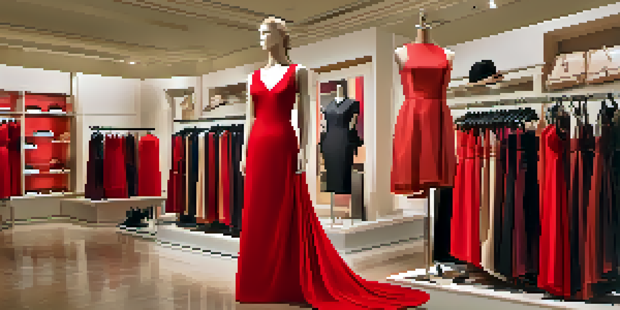
Using Color Contrast for Attention-Grabbing Displays
Color contrast is a powerful tool in visual merchandising that can instantly draw attention to specific products or displays. By using contrasting colors, retailers can create focal points that guide customers' eyes to what they want to highlight. This technique is particularly useful in busy retail environments where standing out is crucial.
For instance, a bright yellow dress displayed against a dark background will naturally catch the eye, making it impossible for shoppers to overlook. This kind of visual impact is essential in encouraging customers to engage with the merchandise. Additionally, using contrast can help differentiate between different product categories, making it easier for shoppers to navigate the store.
Cohesive Palettes Enhance Merchandising
Creating a cohesive color palette allows retailers to attract customers and guide them through their shopping experience.
Retailers can also experiment with varying degrees of contrast to evoke different feelings. High contrast can create excitement and urgency, while low contrast can convey sophistication and calmness. By effectively using contrast, fashion retailers can enhance their visual storytelling and create a memorable shopping experience.
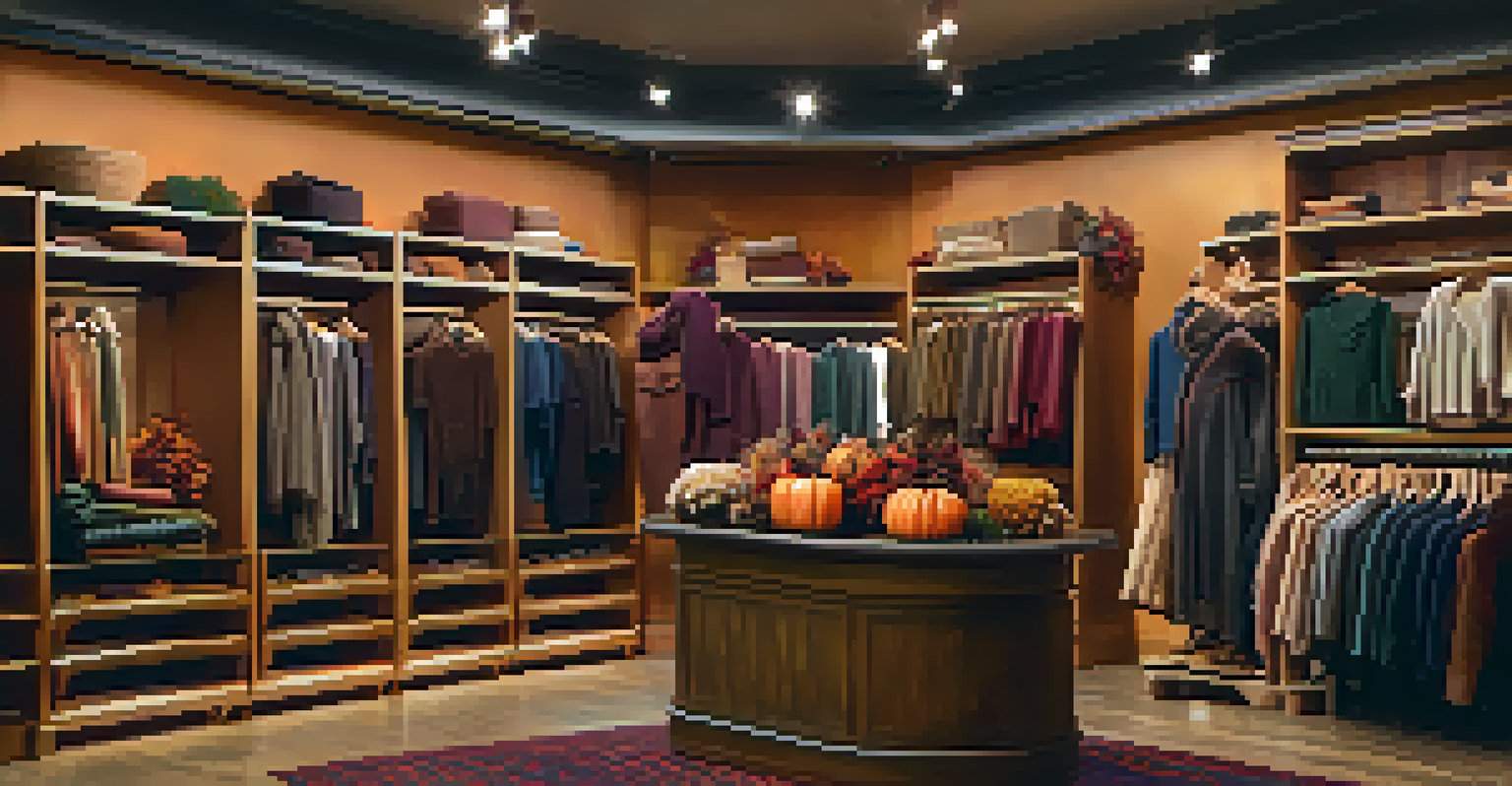
Seasonal Color Trends and Their Impact on Merchandising
Seasonal color trends play a significant role in shaping visual merchandising strategies in the fashion industry. Each season brings a fresh palette that resonates with consumers and reflects current design trends. By staying attuned to these trends, retailers can ensure their displays align with what shoppers are looking for and appeal to their preferences.
For example, spring often brings soft pastels and floral prints, while fall might showcase rich jewel tones and earthy hues. By incorporating these seasonal colors into their merchandising efforts, retailers can create a sense of relevance and timeliness, encouraging customers to explore new collections. This alignment with seasonal trends can spark excitement and drive sales.
Moreover, retailers can leverage color forecasting to anticipate upcoming trends, allowing them to plan their displays strategically. By being proactive about color choices, fashion brands can position themselves as trendsetters, attracting fashion-savvy consumers eager to stay ahead of the curve.
The Role of Cultural Significance in Color Choices
Color meanings can vary greatly across different cultures, and understanding these nuances is crucial in fashion visual merchandising. For instance, while white is often associated with purity and weddings in Western cultures, it can symbolize mourning in some Eastern cultures. Retailers must be mindful of these cultural significances when selecting colors for their displays.
By considering the cultural context of their target audience, fashion brands can avoid potential missteps and create a more inclusive shopping experience. For example, incorporating culturally relevant colors into displays can resonate more deeply with certain customer segments, fostering a sense of connection and loyalty. This attention to detail can set a brand apart in a competitive market.
Cultural Context Shapes Color Choices
Recognizing the cultural significance of colors can help fashion brands connect with diverse audiences and avoid misunderstandings.
Furthermore, retailers can use culturally significant colors to celebrate diversity and inclusivity in their marketing efforts. By showcasing a range of colors that reflect different cultural backgrounds, brands can create a welcoming environment that appeals to a broader audience. This approach not only enhances the shopping experience but also reinforces a brand's commitment to inclusivity.
Future Trends in Color Theory and Fashion Visual Merchandising
As the fashion industry evolves, so does the role of color theory in visual merchandising. Emerging technologies, such as augmented reality (AR) and virtual reality (VR), are changing how consumers interact with color and fashion. Retailers are beginning to experiment with these technologies to create immersive shopping experiences that allow customers to see how colors and styles look on them in real time.
These advancements open up new possibilities for color experimentation, enabling retailers to showcase a wide range of colors and styles without the constraints of physical inventory. For example, customers could use AR to visualize how different color combinations look together, enhancing their shopping experience and encouraging them to explore new styles.
Additionally, sustainability trends are influencing color choices as consumers increasingly seek eco-friendly brands. This shift may lead to a rise in natural colors and materials that resonate with environmentally conscious shoppers. As the industry adapts to these changes, understanding the evolving role of color theory will remain essential for fashion retailers aiming to stay ahead.